Wordle

Wordle

Friday, April 24, 2009

Journal 6

I do think that males are ocjectified and commoditized like women, but in drastically different manners. Women are objectified by a male-dminated society portraying them as sex objects for potential corporate revenue. The ones in charge of marketing, advertising, and imaging understand that when men see a picture of a sexually attractive women, they are not merely thinking about how good they look. The desires of the mla eaudience is what makes it profitable, but with a sinister tinge to it. When women view sexually attractive men, they do not simply see their worth as a simple sexual expletive. Women and men view sex in polar opposite manners. This does not make it wrong, evil, disgusting, or bad. This is just the way it is. In our society of idealized perfect social harmony and equitable treatment for all (which has resulted in some of mankind's best accomplishments), it would be a fallacy to say that men do not view women in some form of inferior way. While men may agree that women deserve equal rights, hang around any men for a few days and one will understand where i am coming from. While this journal prompt has an obvious hint towards the 'sexual' objectification of men vs. women. Hence, my answer.

Thursday, April 23, 2009

Journal 9

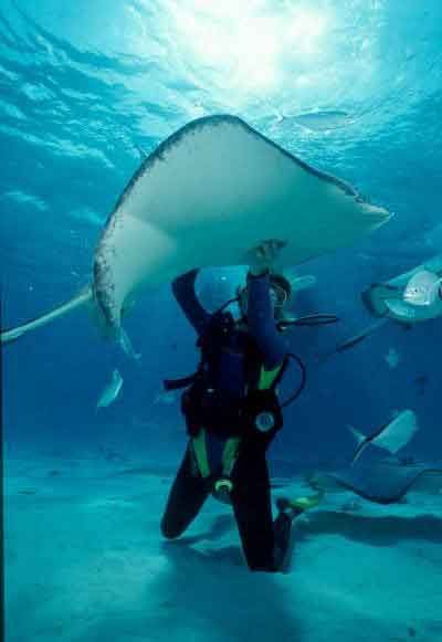
Okay, so I was a tad confused as to what was actually being asked in this assignment, but here it is. I have been a certified scuba diver for roughly six years now, but ever since an ongoing family tragedy several years back, no one in my family has been able to spend money on non-necessities such as diving trips. When I look at this picture, it brings back memories of when I used to go diving in the Grand Cayman Islands, the Bahamas, the Florida Keys, and in Mexico. It honestly is one of the most beautiful and tranquil experiences I have ever had in my lifetime and would suggest everyone to become certified so that you may do it at least once in your life. The most fun you'll ever have in utter silence besides the background sea hum. This particular photo reminds me of when I went diving with sting rays in the Cayman Islands several years back. We also saw nurse sharks that were roughly four feet long as well as moray eels, which mind you are very territorial.

Journal 11

After some searching, I found several websites that represent attractive format and presentation as well as others that seem to be made to induce vomiting. One thing all the ugly websites have in common is that they seem to have no cohesive theme, style, coloring, formatting, or anything that makes it easier for the viewer to take in the important information. There are so many important things that allow information to be conveyed more easily on websites. If there are texts that are separate, but leading to one another, it has to be a soft, yet noticeable transition. You wouldn’t want to have one text be in one color, no matter how well it matches with colors around it, followed by a text colored so bizarrely different that the reader has to adjust his or her eyes to read it. Colors, text, format, order, and flow from one section to another are vitally important to an attractive website. I found one that typified such a eye-appeasing website, which was http://movies.fsu.edu/. It is Florida State University’s website dedicated to activities going on in the Student Life Center/Cinema here on campus. Some great things about it that make it an appealing website is the color scheming. It has a grayish-black background with everything centered in a column at the center of the page. At the very top, it has an animated drawing of things that connote artistry, movies, and entertainment. All the colors work well as the main scheming is either red, black, or white. It is also very clear where to go if you know what you are searching for. Bigger groupings in larger, bolder text with subtexts in much smaller displays.

Journal 12

Throughout this semester, I have been exposed to many different writing styles, techniques, and voices. For this experience I have to thank workshopping in our classes. I found it very interesting, if not useful to see other people's approaches to the writing assignments we were given for our papers. One of the biggest things I have honestly learned from taking this course is to not wait until the last minute to do an assignment, especially when it's a research paper. My writing style has not changed so much per say as it has rather been made more aware of my tendency to ramble on sometimes on diatribes that are tangential at best. I usually have a pretty good voice, but I need to incorporate my new writing tools such as setting up different sentence formats instead of the same old noun, then verb structure. One thing I learned to capitalize on is my ability to seem very eloquent, expressive, and insightful. This is one of my strongest writing points. I learned much about communities, and got some fascinating insight into how certain communities live out their lives. I, however have not had my opinion or attitude changed towards said communities as I have always had an open mind about things or people that are different from what I considered normal.

Monday, April 20, 2009

journal 12

ENC1102 this semester has been mainly focused on writing papers. it shows the student how to use the drafting process and how to make revisions to those drafts. the class taught me a lot about research papers too. the lady from the library taught us a lot about all the resources that FSU students have right at their fingertips. the class also taught me about communities. we looked at many different communities and saw how they were represented through stereotypes. overall, i thought this was an interesting class and I would recommend it to anyone who is required to take it.
Based on what you've learned so far this semester, what has changed in your writing? What will you continue to do that you've learned and what will you choose not to do? What have you learned about communities? Has your perspective changed at all?

I have learned a lot about my writing from this class. This class has helped me realize that much of my writing does not have enough examples or vivids. I need to show not tell. I have also learned a lot about research papers and how the proper way to write them actually is. I learned a lot about the communities I am and the ones around them by simply reflecting and writing on them. Much of this class was reflective and observatory which really made me think and engage in the topics in which I was writing. My perspective on my community hasn't necessarily changed but broadened vastly compared to what it used to be. Overall, my writing has improved some, but I still need some work in some areas. Practice makes perfect.

Changes...

Not much has changed in my writing. I have learned to avoid being "list-y", putting all of my ideas down at once and ignoring the elaborating. I've also learned that everyone can tell when I'm padding the paper with wordy-ness, not just me. So at all costs avoid that cliff.

As far as communities I have learned to look at them a new way. Especially stereotyping and the role that the use of stereotype plays in misunderstandings between culture. I really enjoyed the media paper, it gave me the most time to analyze and organize these thoughts.

Overall good experience, I definitely watch "Weeds" differently nowadays. :-)

Journal 12

I have learned a lot to further improve my writing this semester. One of the bigger things I started doing to my papers was adding more details and examples to help further get my point across. I also learned how to organize my papers better making it flow more. From writing paper two I increased my researching skills and how to incorporate research into a paper. Not only did I learn a lot about writing in general, but I also learned about different communities. From the final project we are doing I came to realize that communities can be so different, but there can often be connections found between them. Overall I believe I learned a great deal from this class and it will help me to become a better writer.

journal 12

Throughout this semester I have learned a great deal about writing. I have realized how important the drafting process is and how having multiple drafts and peer editing really help to make the final product much more focused and clear. I have also learned that making an outline before beginning writing the paper really helps me to organize my thoughts know what exactly I want to say and get across. I feel like my writing has a more clear tone and style now after all the exercises and writing that we have done in class. I really liked the fact that all three of the papers we did all focused on communities because it has made me think about something that I usually do not give much thought to. It also made me realize how communities are all affected my stereotypes and that it is very important to look past them because they are usually very un-accurate.

What I've Learned

This semester my writing has improved through all the different papers and workshops that we’ve had. I have learned how to add more detail to my papers and how to back up everything that I say. I will continue to add more detail in the future and limit the general statements, as well as continue to cite every source I use, both in text, and at the end. Since all of our papers were about communities, I have learned how each community is different but at the same time have a lot in common. Not every community has to be a city or made up of a specific ethnic group. There are many different forms of communities, and they are all made up of a group of people. Each community suffers from stereotypes in one way or another, and writing all these papers is going to help me be more open to them in the future.

what i've learned

My writing has improved significantly since I started taking this course. I think that my writing improved because now i take more time to edit and draft and consistantly work on my papers. My research papers became stronger from ENC1101 and my overall confidence with my writing has gone up. Throughout this course, I have learned many things about communities. I have learned that communities are very complex due to the research that I did. I learned that stereotypes may appear true but there is more to that stereotype than people think.

Judgment

I learnt a lot this semester about looking at things with different perspectives.  When discussing so many different communities that are foreign to me I learnt that I could not be judgmental of the communities before I read the papers.  Just like some of my papers, some people pre judged what they thought of my subjects and then made fun of them.  Then they read my papers and they learnt a lot about my communities.  I also learnt new techniques of writing and not being scared to write about a certain topic.  The first paper I wrote I was not sure how the class would react to it so I did not go into much detail.  Once I became comfortable with the class I felt I was able to open up more about certain subjects. 

Sunday, April 19, 2009

this semester

i have learned so much this semester! i have learned my strengths and weaknesses in my own writing. one way i learned how to do this was by analyzing others' work and seeing what makes writing strong and appealing. i learned my writing is sometimes vague and specificity makes strong writing. also, i learned imagery and humor is a large part of my personal presence and i will continue to use these techniques. i really liked the topics we were assinged with. even though the topics were about communitties they were broad and really let us decide what we wanted to write about and it let us put our own influence in it. i also got a chance to look at different communities from different points of view. from writing about my own, i learned that a lot of ppl dont know the truth about my town. this is also the case when writing about my greek life community. i learned that each comunity is special in its own way and all should be given a chance. also, with the topics assigned i really feel like we got closer as students. and, that teacher got to know who we are better through our writing.

This semester

This semester has been very different than any other semester i have had as far as my writing classes go. I have learned a lot in a couple different aspects. One is that just because you get used to one teacher who loves your writing the next one may think not so highly of it. This has taught me to unfortunately take myself more out of the writing and just make my writing more bland and universal. On a brighter note this class has taught me a lot about communities and different ways to view them. I use to think of a community purely as a town but now i see it can be law enforcement, sororities, or even a group of friends. This has really opened my eyes to other communities. Although i am tired of talking about communities i am glad i have learned what i have from them. In the future i may use what i have learned from this class to incorporate into other papers how and what communities really are.

what i learned

Based on what you've learned so far this semester, what has changed in your writing? What will you continue to do that you've learned and what will you choose not to do? What have you learned about communities? Has your perspective changed at all?


In this class, i have learned many things regarding research papers. Specifically, I have learned how to convey my point with facts and research while incorporating my own voice in an appropriate manner. I would say that my voice has gotten more controlled and more efficient. I feel like I can use my voice to say what I need to say effectively. I will continue in this way in my future papers, and use the skills acquired from this course. As far as what I will not, or would choose not to continue to use...it would be MLA format. This is just one thing that is nitpicky, but necessary to learn for future classes, but I wouldn't mind if I never used it again. I have learned some things about my community. I enjoyed researching the colorblind community, for example, because I was interested and actually yearning to find facts and information about the condition that I have. I wouldn;t say my perspective has changed, per se, but it has been challenged and tested. My mind has been open to other perspectives, and I think that is a healthy thing.

what i learned

Overall this semester, I learned how to view communities and stereotypes in a different light. With my writing I learned that more detail and examples should be put into a paper, as well as complete thoughts that are thoroughly analyzed. I learned about communities a lot in this class. Before this class I only thought of communities as developments not as groups of people. After taking this class I now see communities as geeks, communists, democrats, republicans, social lights, and so many more. After writing about communities the entire year I’m rather excited for a change next semester. Although im excited to end the community papers, I did learn a lot from them. For example, I learned that even though I think I may have explained something enough, that it may not be clear to the readers. I also learned that certain stereotypes may be looked upon as negative in one light, but when looked at in a different light, could be something brand new that you never knew. I try to not look to stereotypes before really getting to know a person. After this class I have learned that you have to look at both sides of something, and that communities may be looked down upon by some, but there is always another side to show. I think what I’ll take to my next writing classes is to use lots of examples, and really explain what I mean so others will too understand what I try to convey with words.

enc1102

This semester has been gone well. My writing has improved a lot and I'm pretty satisfied with how the year has turned out. I think my tone in my papers is a lot better and I have a different style of writing due to excerises in class and reading other peoples papers too. I also think that i write use a wider vocabulary too after reading other papers and such. I've learned a lot about communities. Writing about different communites sort of broadens my view of others around me and gives a new light on communites, I enjoyed the essays we did in class, the last one especially because it made us get involved in a community that we weren't necessarily involved in.

Friday, April 17, 2009

This Semester!

Overall this semester I have learned a great deal. Since we've been doing various exercises throughout the year, I have tried to apply all my new knowledge to my 2nd and 3rd papers especially. In the begininning of the semester I tended to sometimes loose my point, focus, and voice partway throughout the paper and now I feel that I can write a whole paper without losing any of these aspects. I have learned that communities can be portrayed in any way you choose as long as there is a valid argument and adequate details to support your claim. My perspective on communities haven't really changed because as I wrote in my first paper I live in a community that is stereotyped negatively on a daily basis so I feel that I have always had a grasp on the different ways people view things.

Journal 12: Due Monday, April 20

Based on what you've learned so far this semester, what has changed in your writing? What will you continue to do that you've learned and what will you choose not to do? What have you learned about communities? Has your perspective changed at all?

Wednesday, April 8, 2009

journal 11

One very ugly website that I stumbled across was http://paperrad.org/. This is one of the most poorly designed websites I have ever seen. The main page shows dogs faces all along and up and down the page. The area behind the dogs faces switches between bright blue and yellow about 5 times a second. Everything is center justified, but because of the bright changing background your attention does not really go to the middle. Plus everything to click on in the middle is extremely bright too, but it is hard to see because of the obnoxious background. Most of the text and visuals in the center are changing colors or moving, which also make it hard to tell exactly what there is. There is so much going on in a small space and too many changing visuals that it just does not work at all.

SI.com

Sports Illustrated is a very proffesional website. It has numerous categories and links across the top of the webpage and the overall tone of the website is exciting and makes you want learn more about the website. At the top, it has all the box scores of baseball games which makes it easy to check out scores and updates without searching. They have great pictures that grab the audience and make you want to read them. This website has every sport imaginable and the overall prescnese of the website says its proffesional. I think it was a welll put together website.

Espn

A website that I find to be very attractive and attention getting is ESPN.com . ESPN has bright colors on the home page mixed with extraordinary pictures that capture events and people emotions throughout sports. ESPN has a website full of interesting things to go through. From highlights of sports events, to information on upcoming fights, baseball games, football, games, basketball games, ect. Espn has pretty much everything you want on its home page and is easily assessible. People can vote for different things throughout the website, write to ESPN, leave comments on things, and even watch sports event live. ESPN.com is like a mini television station on your computer.

Facebook

Layout, Layout, Layout. Face book’s website is always changing the layout in order to keep up with the ever so popular applications continually being added daily. The latest set up is kind of weird though due to the new columns and everything, such as people adding new pictures or whose birthday is when I snow smushed off to the side where you can’t really see anything on your homepage. When you travel on to your actual profile page however, the website becomes easy to navigate with tabs to view pictures, see others applications, as well as information about you if you’re on your profile or others if you’re on a friend’s page. Facebook makes it easy to find friends with the search at the top of the page, just type in a friend’s name and their school and usually it should pop right up. Also this page has links all over the place that lead to different things at the top of the page in dark blue is where you can click to navigate home, view your friends and see their statuses as well as travel back to your own profile page. Though this set up was hard to get used to at first with everything on the home page being so close together on the last column and the middle column being so big just to view statuses I would say that this is a decent website with its colors drawing you to a certain link and the easy access to click a friends picture and view their profile and pictures.

Movie Website

http://www.imdb.com/

I chose IMDB.com (Internet Movie Database). It is probably the best website out there in regards to finding information on a movie. The layout is nice and simple and easy to navigate through. The background is white and they use dark blue around the most important tabs and links, to get your attention. At the top-center of the page, they have all the popular tabs such as now playing, tv listings, showtimes, and tickets. Right under that is the search bar where you can search for movies, actors/actresses, etc. On the left of the page they have an updated list on movie info., such as tops at the box office, coming soon, new to DVD, etc. On the right they have a few more links to popular articles, and a list of all the famous artists born today. In the center they have all the news articles and links to some trailers.
When you search for a movie or person, it takes you to a page with other people and movies that have a similar name, where you can easily find the movie or person that you are looking for. If you search for a movie, it will give you a few photos related to the film followed by a user rating, director, writers, release date, genre, plot summary, and cast. All the way in the bottom, you can find a discussion board, and on the left there are numerous links sorted by category to find more info. on the movie. If you search for an actor, it will give you their birth date, life bio, and a chronological lists of all the movies they have been on, which you can click to see info. on that film. This website is filled with information and it is all really well organized.

Classy and Unique

www.Chanel.com/


Target.com

The website i chose was WWW.Target.com. The website has targets main colors white and red. It has advertisements from their weekly ad on the home page as well as all their search options. It is easy to read and kind of inviting. The only problem is that becuase they have so much stuff the site, even the word links seem so crowded and busy. the alignment is off because some words or pictures are bigger than others. Thats what makes it look pretty busy. Altough it does look busy it really is helpful because there are so many link to research including services for employees or a detailed description if you ordered somethign online where your package is. I order from this website frequently because i love target. I can see that they try to target very different crowds with their red white and black color scheme. Some may say those colors are boring but its just tryign to be more general verse so specific you can find thign from computers to shoes to meat branders!

Good Website

A good website that i use a lot is http://www.southparkstudios.com/. It provides the right amount of graphics and pictures to entice you, but not strain your eyes. I personally like it because it is well organized and easy to find your way around. It has a title bar that goes horizontally across the top of the screen with topics in order to categorize everything. A search bar is alo provided if you can not find what you want right away. Also for showing every episode of South Park for free it has very minimal advertising.

The key to any good sports website

http://espn.go.com/

The key to any good sports website (besides the information) is layout, layout, and layout. The average sports fan when he loads up ESPN is immediately witnessing a crispy high definition layout of the the days top sports stories. The top 4 stories (or the ones ESPN thinks are most important) are presented slide by slide with a picture and quick description of the story, clicking the picture takes you to the full article. On the side you have the title of the some other top news stories along with the option of having "my headlines". Overall the sites is very crisp, neatly laid out, almost in a sort of "digital newspaper" type layout. The font is easy to read and appropriate colors. The depth/background is a light red with the the top holding the scoreboard of various sports teams and below links to different segments of the website. The emphasis is put on the main story slides they immediately draw attention both due to its size (taking up the most) also the fact they hold usually high def image of the story in particular. The other headlines on the side are less striking and are there for the reader to see after he sees the main headlines. Like I said earlier the alignment is great and neatly laid out, you can tell emphasis was put on making this site both attractive and user friendly, the alignment is almost makes it appear like a digital newspaper. Overall, one of the better designs on the net.

ugly website

one website which i found extremely painful to the eyes was a personal website of a weird kid who went to my high school. the website is http://www.jeff-cater.com/. It does not surprise me at all that he would make a weird website, but I thought it would at least be aesthetically pleasing. Instead of drawing in the viewer with attractive themes or layouts, his website has a background of random colors that makes the font incredibly difficult to read. Additionally, the font is very small which makes the website hard to read. Another thing I did not like about the website was that the links were in odd places and it was hard to navigate through the site. Also, there is really no point to this web page. It mostly says that the website is under construction. the part that is up and running is just information about this weird kid and his girlfriend (who is harsh on the eyes) he has never met before. Although I did not browse the entire website because it was unpleasant, from what I saw I give the website an F.

Tuesday, April 7, 2009

The secret to a good web page...

http://postsecret.blogspot.com/

Post Secret has a well laid out webpage.
I think it is beautiful because it focuses of the people's art first. The cards are justified left, where the eye looks naturally focuses while reading. No attention is taken away from the postcards with background or advertisements, the background is plain black.

Advertisements for the books, and sometimes college appearances, are located near the bottom of the page and they are not intrusive. The ads look like postcards themselves, as do the helpline and suicide hotline ads. Post Secret plays to it's audience, while it effectively and intentionally draws attention to certain areas of the page.

Monday, April 6, 2009

Tiffany and Co.

http://www.tiffany.com/ is a classic jewlery store that has been around for many years and its website matches everything Tiffanys is known for: simplicity. The large colorful rings grab your attention really quickly but is the only bold and standout image on the page, everything else even the font is very simplistic with thin font and traditional tiffany colors. It is center justified which drags your attention straight to the middle of the page and all of the links are spaced out, which allows your eye to flow from the left to the right and down the page. This makes the website clear and easy to read, all of these elements make me want to read more. Even the organization of the website is perfect and resembles that of a classic and perfect Tiffany and Co. ring. The website carries the idea of the eye moving from left to right all the way through every link, it is very consistent.

designs

http://home.comcast.net/~dmaneyapanda/zugorific/personal2.html Here is a website that is in a league of its own. Not only is it impractical, but it is just a mess. The disgusting background inhibits the websurfer to even read the text. To even get a glimpse of what it said i had to highlight it. It is a poorly designed sight that is not pleasing to the eyes. It actually makes me want to look away and shield my eyes. It's a trainwreck. The layout is not user-friendly and confusing. Granted it's a personal page, it still is an awful design. It doesn't draw your eyes to one specific place. It doesn't emphasize anything. Everything is kind of mushed together...no order whatsoever. All that being said, this is an abysmal site.

Journal 11- Due Wednesday, April 8

Consider the elements of visual design that we looked at in class today, such as contrast, text, alignment, proximity, organization, and emphasis. Find either a very "ugly" or a very "attractive" website that is poorly or well designed according to these principles, and tell me why it doesn't or does work. Be sure to give specific examples.